So far, not impressed.
For some, it’s one of the most exciting times of the year – Android Beta time!
Before Google releases a major operating system upgrade — in this case, from Android 11 to Android 12 — they release a public beta version to select users (usually Google device owners), allowing them to test drive the OS, provide feedback, and find bugs. The current beta of Android 12 was made available as of May 19th and will go through several iterations before the final version.
Let’s start with the obvious — yes, it’s a beta, and it is almost certain to have bugs. That being said, let’s dive into what I do and don’t like about the beta.
THE GOOD
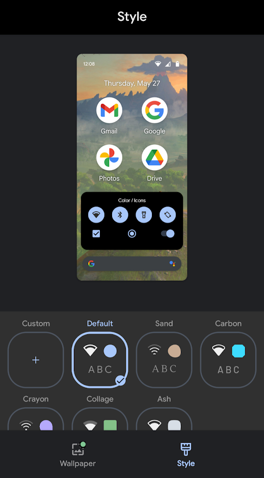
Some nice new customization options have appeared in the Settings menu, offering a greater degree of personalization for your phone. You can now choose fonts, icons, icon shapes, and theme colors all in one place. Unfortunately, the range of fonts and colors is fairly limited, but it’s nice to have the option anyways. It’s likely this is an area that’ll be beefed up in future iterations.

The overall performance of everyday tasks seems slightly zippier too and there’s subtle visual changes here and there as well, including tiny sparkles when you select an item within the OS. These changes don’t seem to affect battery life, as my four year old Pixel 3 XL hasn’t experienced any additional battery drain.
THE BAD
I’ve experienced numerous soft crashes and random restarts while doing mundane tasks, like opening Spotify, switching apps, or, in one case, nothing at all. Again, this is a beta, so I knew what I was getting in to, but crashes are nonetheless, frustrating.
Perhaps most annoying of all, though, is broken notifications in various apps. Text messages don’t always vibrate and Discord notifications have been completely killed off.
THE UGLY
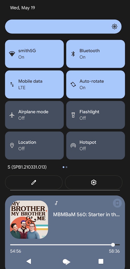
Not all of the visual changes are welcome. The pulldown menu has become a bloated, ugly mess. Android 11 has a neat, attractive row of icons to represent various functions, fitting most of them on one page. Now, they’re monstrously bulbous things that take up the entire screen. Yuck.

All in all, these amount to annoyances more than anything. This early look at Android 12 is promising but the OS needs work.
